by Charles Plant | Mar 24, 2017 | Random Musings
 OK, this is it. I’ll stop with all these posts about Toronto House Prices metrics after today. I’ll find another way to annoy people next week.
If you’ve been paying attention I said the press is consistently using entirely the wrong metric to look at house prices. It doesn’t matter what the average house costs compared to the average income, what matters is the percent of income required to buy the average house.
But even that isn’t a good metric, as existing homebuyers who have built up great equity really aren’t hurt much by the run-up in prices.
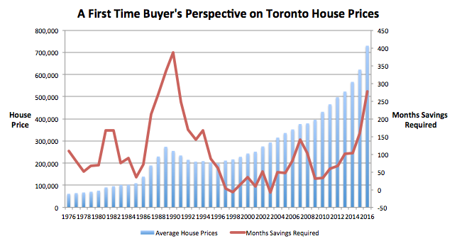
So in this price escalation, the one thing that really matters is the effect on new homebuyers. And to look at that I’m introducing my third and final metric.
The banks will lend let’s say up to a level where a person’s housing debt service ratio is 30% of income. (The actual number may be higher but given potential credit card debt, I’m using this number as the limit for the sake of analysis – it’s called “Fun With Assumptions.”)
What matters given this limit is how long it takes to save a down payment (or borrow it from relatives.) The only way we can look at this effect is to look at the number of months it takes a new buyer to save enough money so that debt service payments are 30% of income.
You can berate my assumptions in comments but I’m assuming for the sake of analysis that the average buyer can save 10% of their pretax income for a down payment. So the question becomes then how long does it take to save for a house?
And this is where we have a problem and our mini-bubble is in crisis mode. The graph above shows house prices in blue and the red line represents the number of months savings required. This number is well above historical norms and is exceeded in level, only by the years 1988 – 1990. If you remember that time we had a huge correction in house prices
But here’s the problem. As we saw yesterday, the run-up in progress isn’t a problem for people who already own houses. It may not be a problem for foreign buyers, many of who will see Toronto as a reasonably priced market. But it will be a major problem for first time buyers. And this is really the only metric that matters now.
Is this going to be enough to bring the market to its knees? Who knows? The last time we had a big crash, prices were bad for everyone. Now they’re only bad for a few. And that’s the problem with this bubble. Since it isn’t caused by rates and is caused by price run-up it is a different type of bubble.
Only when you use the right metrics can you see what the bubble really means.
by Charles Plant | Mar 22, 2017 | Random Musings
 Today’s article on the front page of the Globe and Mail, calling for something to be done about surging house prices, is another example of bad metrics creating potentially bad policy.
As I explained in Monday’s post, the comparison of house prices to average income is just a bad metric as what matters is not the price of a house but how much mortgage interest is paid. Yesterday’s post uses a better metric to show that we are in the midst of a tiny bubble that bears no comparison to past bubbles.
Today’s Globe article says that “While some industry observers argue that foreign buyers are playing an increasingly influential role in the GTA, Mr. Henderson said the bulk of housing demand is from Canadian citizens or permanent residents who have been emboldened by low interest rates and a healthy economy.”
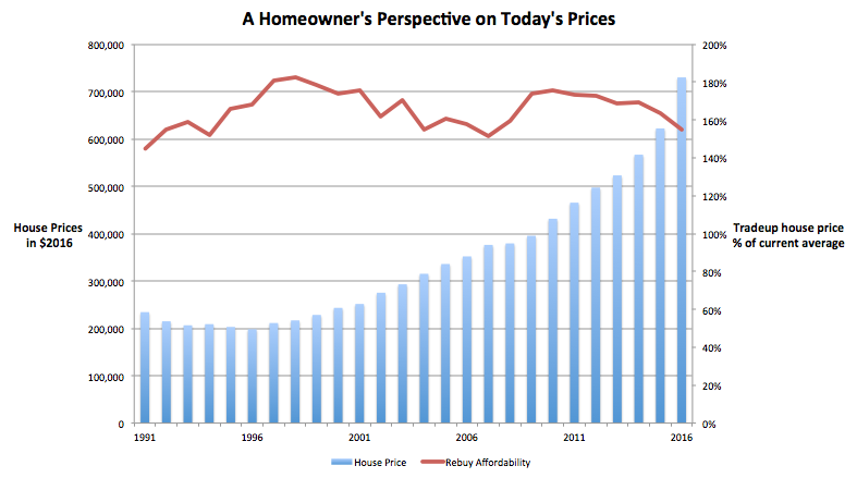
I must admit that I don’t know whether foreign buyers are fueling demand. What I do know though is that for existing house owners who want to trade up, things look pretty good and I imagine that there is a large component of pricing run-up that is due to existing house owners trading up.
In order to look at the cost of trading up I created a brand new chart. It attempts to show what someone trading up can get in today’s market as compared with the past. (Yippee, I get to do more analysis.)
Let’s say you, Ms. Average Income Earner bought the average house way back 15 years ago (which I did a little research on and computed as the average time someone owns a house before trading up.) And let’s say you put 20% down. Since then you have paid your mortgage payments religiously and with the recent surge in house prices, you have a pretty good nest egg built up. The question is, since you’re still earning an average family income, what can you now afford?
As it turns out, you can afford a house that is 55% more expensive than the average house. You can see from the red line above, while that is the bottom of the range we have seen for over 25 years, it is by no means totally wacky. Yes, most of the time you could have gotten a better deal trading up but there have been a few times that we’ve been in the same range.
The point is here that while things are on the high end of normal, we are by no means in a bubble. For the average homeowner, there is still no problem getting a better house by trading up. In fact, this factor may be a partial cause of the rapid increase in prices as existing owners decide to capitalize on the enormous equity they have and move on up.
The risk is that we use a bad metric such as the one we’ve outlined Monday to create a policy to dampen house prices when the bubble is a lot smaller than everyone thinks. That’s stupid.
by Charles Plant | Mar 21, 2017 | Random Musings

If you read yesterday’s post, I spent it ranting on about how I was fed up seeing bad metrics used to explain what is going on in the housing market in Toronto. So today I thought it might be useful if I showed you a better metric. So get ready for it, another day, another exciting metric.
What I said yesterday was that it is silly to compare the price of the average house to average income. That’s because what people are committing to is not the price of a house but a stream of mortgage payments. If they can afford the mortgage payments, who cares what the price of the house is?
The chart I so elegantly constructed above with the help of my best friend, Mr. Excel, shows with the red bars, the price of the average house in 2016 dollars in Toronto. (That way you can see real increases instead of seeing the effect that inflation had in the 1970s and 1980s.)
The blue line shows a much better metric, the percent of monthly income required for the average family to afford the average house. Banks will only lend up to a certain point and that lending doesn’t care what the price of a house is, only what the percent of a person’s income will be spent on housing. So this metric has real applicability. At some point the average house becomes too expensive and the market for housing dries up and crashes.
Let’s look at a few prior crashes. Mortgage interest rates went wild in 1981 and 1982, reaching almost 20%. (Can you imagine what that would be like now?) The result was a spike in the percent needed to buy the average house. During this period, you can see that the real price (inflation adjusted) of housing declined steadily from 1976 until 1984. This decline was masked by inflation which made everyone feel prices were actually going up
The next major peak was in 1989/1990. Interest rates at the time weren’t as much of a problem. They went from 11.25% in 1987 to 14.25% in 1990. During that time, an irrational exuberance in the market coupled with a boomer influx caused house prices to climb rapidly. But interest rates spiked, caught the market off guard, made banks tighten lending, and made it unaffordable for the average person to buy the average house. The result was a precipitous decline in the market.
The next real dollar decline in prices was in 2007/2008 but this one was small. Interest rates at the time were hovering around six and seven percent. They weren’t the cause of the crash though. I’m sure how you haven’t forgotten that we had a bit of a banking crisis and guess what happened, mortgage lending tightened up due to the unavailability of capital.
But the big surprise to me at the time was how rapidly interest rates declined. They fell from about a 7% posted rate to rates last year that were hovering in the mid threes. That decline in the rates, dramatically lowered lending costs and the price of houses climbed every year since. We’re seeing another sign of irrational exuberance. It has created a small bubble as you can see on the chart. Interest coverage is sitting at 35% for the average buyer of the average house. This is up from an average 25% level where it has been sitting since 1997. But this is nothing like the bubbles of 1982 and 1990
So we have a little bubble, not a major one. Before I opine on when our mini-bubble is going to pop, I’m going to show you another couple of metrics. Tomorrow I’ll look at a metric that applies to people who are already house owners and Thursday I’ll look at new buyers. (If you’re still reading, congratulations and thanks for being a metrics geek.)
by Charles Plant | Mar 20, 2017 | Random Musings

There has been a lot of talk recently about Toronto’s housing bubble. In fact, I think if you check, the talk has been filling up the press for several years. Well if all of these people are right about the bubble, when is it going to pop? I don’t think in fact that there is much of a bubble, I just think it is bad metrics. (I can feel you getting all excited out there…”oh, goody”, you’re saying, “we get to talk about metrics.” Calm down there, let’s not get too excited.)
Let’s look first at the common metric used to declare there is a housing bubble. That metric shows the relationship between the average house price and the average income earned. You can see that ratio demonstrated on the lovely graph I created showing data for the city of Toronto.
Going back to 1976, the graph shows the average house price in blue and the ratio between house prices and income in the red line. It looks just terrible doesn’t it? This is the metric that everyone is using to show a bubble.
Unfortunately in the land of metrics, comparing house prices to income is just silly. What matters isn’t the price of the house but what you pay on mortgage to own the house. So there is another factor which is left out of the bubble analysis and that is interest rates. I’ll explain how that all works in tomorrow’s post.
Meanwhile, I saw an article on the weekend with even sillier analysis. BMO has done some extensive research (I think they actually just played with Excel one day) and come up with the claim that even Toronto’s 1% are being priced out of the housing market. You can see the article summarized in Huffington Post.
The research says that someone earning $225,000 (the 1% cutoff line) can’t afford the average house. The analysis says that with $100,000 down, the most that a 1%er could afford would be $987,000 but the average detached house is $1.2 million.
This is just crazy though. Since when do people who make $225,000 a year only have $100,000 for a down payment? Don’t you think that people earning $225,000 a year might have had a house for some time now. After all, I don’t know many people for whom $225,000 is a starting salary.
And if they have been earning $225,000 and had a house for a while, let’s say 10 years, don’t you think they would have a big chunk of equity in their house? In fact if they bought the average house 10 years ago with $100,000 down, their house cost $350,000 and after paying a mortgage for 10 years, they would have $537,000 of equity
On this basis they could, according to BMO’s statistics, afford a house worth $1.45 million, well above the $1.2 million average.
I know you’re finding this to be exciting stuff so tomorrow I’ll show you a better metric to use when evaluating the housing market and you’ll see why the bubble everyone claims might not be quite as alarmingly large as everyone thinks.
by Charles Plant | Mar 13, 2017 | Entrepreneurship
We are pleased to introduce the Narwhal List for 2017. Our previous Impact Brief (A Failure to Scale, February 2017) set out to show that relative to US firms, Canadian companies have historically slower growth rates that make them less appealing to potential investors. We concluded that Canadian businesses have the potential to overcome this issue and position themselves as more attractive investments, but they must be more aggressive, raising capital earlier, more often, and in larger amounts.
Emerging technology companies that wish to attain a significant share of global markets must be able to attract substantial financing. Certainly, this has been the trend for the high-profile group of startups also known as Unicorns. A term coined by the technology markets intelligence firm, CB Insights, a Unicorn is defined as a private company with a valuation at or above $1 billion. All of these firms have been propelled to world-class status by significant injections of early- and late-stage venture capital (VC) funds. In the early stages, Canadian companies must accelerate their growth and their consumption of capital to earn the returns necessary to attract later-stage VC financing, particularly if they wish to reach and compete at the Unicorn scale.
In order to provide a tool to enable entrepreneurs and investors to gauge how attractive firms are from a financial standpoint, we have, in this report, introduced a way to measure Financial Velocity. Financial Velocity is defined here as the amount of funding a firm has raised divided by the number of years it has been in existence. It is expressed in millions of dollars per year. This measure reports the rate at which companies raise and consume capital. We have assembled a list of the top Canadian businesses based on Financial Velocity and are pleased to introduce the Narwhal List. (The term Narwhal was first coined by Brent Holliday of the Vancouver-based Garibaldi Capital Advisors who graciously allowed us to use it.)
The Narwhal List identifies a set of young Canadian companies that have the potential to become companies on the world stage. It also points to possible financial pathways to turn these companies into Unicorns, which are closer to reaching public financial markets. The transition to the Unicorn scale and possibly public listings may give our firms the ability to compete on their own merits and have the currency necessary in public stock to fund acquisitions throughout the world that will lead to greater scale and world-class status.
A full up-to-date list of Narwhals is published here. The following short list shows the top Canadian companies as at December 31, 2016.
The Narwhal List 2017