 Today’s article on the front page of the Globe and Mail, calling for something to be done about surging house prices, is another example of bad metrics creating potentially bad policy.
As I explained in Monday’s post, the comparison of house prices to average income is just a bad metric as what matters is not the price of a house but how much mortgage interest is paid. Yesterday’s post uses a better metric to show that we are in the midst of a tiny bubble that bears no comparison to past bubbles.
Today’s Globe article says that “While some industry observers argue that foreign buyers are playing an increasingly influential role in the GTA, Mr. Henderson said the bulk of housing demand is from Canadian citizens or permanent residents who have been emboldened by low interest rates and a healthy economy.”
I must admit that I don’t know whether foreign buyers are fueling demand. What I do know though is that for existing house owners who want to trade up, things look pretty good and I imagine that there is a large component of pricing run-up that is due to existing house owners trading up.
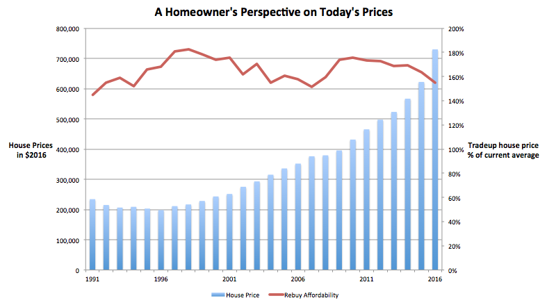
In order to look at the cost of trading up I created a brand new chart. It attempts to show what someone trading up can get in today’s market as compared with the past. (Yippee, I get to do more analysis.)
Let’s say you, Ms. Average Income Earner bought the average house way back 15 years ago (which I did a little research on and computed as the average time someone owns a house before trading up.) And let’s say you put 20% down. Since then you have paid your mortgage payments religiously and with the recent surge in house prices, you have a pretty good nest egg built up. The question is, since you’re still earning an average family income, what can you now afford?
As it turns out, you can afford a house that is 55% more expensive than the average house. You can see from the red line above, while that is the bottom of the range we have seen for over 25 years, it is by no means totally wacky. Yes, most of the time you could have gotten a better deal trading up but there have been a few times that we’ve been in the same range.
The point is here that while things are on the high end of normal, we are by no means in a bubble. For the average homeowner, there is still no problem getting a better house by trading up. In fact, this factor may be a partial cause of the rapid increase in prices as existing owners decide to capitalize on the enormous equity they have and move on up.
The risk is that we use a bad metric such as the one we’ve outlined Monday to create a policy to dampen house prices when the bubble is a lot smaller than everyone thinks. That’s stupid.

Charles, enlightening points of view in all three posts. I’m not a metrics geek by any stretch so may be deluding myself, but your view seems to make a lot of sense. Please flatter yourself and write some letters to the editors of our esteemed local and national media outlets. It would be interesting to see what traction a non-stupid opinion might get!
Greg, thanks again for the encouragement. Unfortunately, this perspective on the topic is entirely too esoteric for most newspaper writers. They want engaging – pull at the heart strings stories and metrics don’t cut it. In their world, simpler is better.